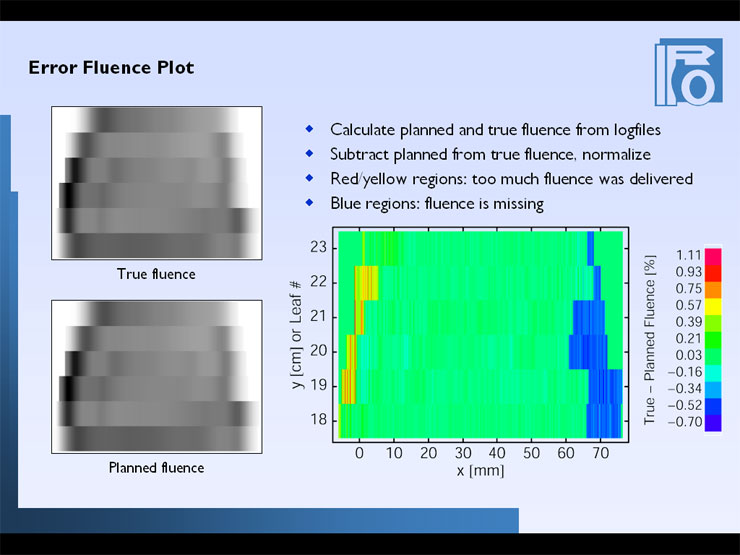
The results look like this, here a clinical example for a certain patient treatment. The upper picture contains the fluence that was really delivered to the patient, calculated out of the true leaf positions, and the picture on the bottom shows the plan. They look the same, so its best to plot the difference and normalize it to some value, I took the maximum fluence in the plan. Then you get values that can be interpreted as the fluence deviation in percent. The color bar shows the range of deviations. [In this example, it looks like there is a tendency to have too much fluence in the beginning and and a little bit less in the end (shown in blue). This is the general pattern for many of the motion files generated with the new CadPlan version, where the first and last shapes are not closed any more.] The next problem will be how to verify this calculation with external measurements, because the blue and red regions are just where the highest dose gradient is. But its nice to see that everything is o.k. in the central part - that's where the dose is.