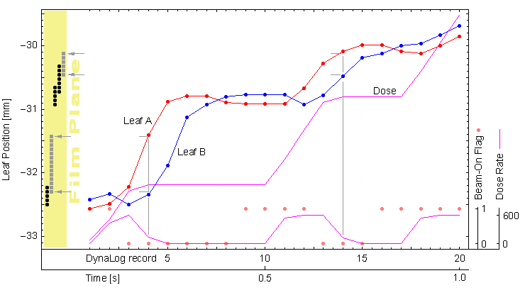
The principle of DynaLog analysis can be shown in a single plot:
The leaf positions of a certain leaf pair, as they are contained in the logs, are plotted in red and blue. They are plotted as a function of the log record number (20 log records are shown on the horizontal axis). Every 50ms a new record is added to the log. The leaf positions in mm at MLC level (vertical axis) are simply 1/100 of the raw log values.
The observable "penetration" of opposing leaves is a "feature" of older leaf sequences. With all newer versions of the Leaf Motion Calculator, it is possible (and recommended) to define a minimum leaf gap (e.g., 0.5mm), so closed leaf pairs that move are no longer generated (this reduces wear and speeds up delivery).
To calculate fluence or dose at a certain position on film, I do the following: for every log record, I look at the A and B positions of each leaf pair. If there is a gap and there is dose rate, I add a certain number of "photons" to each "pixel" on the x-axis. The number pf photons is proportional to the current dose rate, which can be calculated from the fractional MU counter in the logs. One does not have to care about units, so I simply take the integer difference of fractional MU values between two successive log records as the "dose rate".
Important is: no dose rate = no dose on "film". In the above image, photon contributions for weak dose rate are shown as light grey dots (together with grey lines, so that you can see where the contribution comes from), whereas photon contributions for full does rate are black dots (no lines shown, but it should be clear from which log record the "photons" originate).
Just loop over leaves and over time and you are done!
Although there may be other more effective approaches, this algorithm of looping over time and leaves is the most simple and straightforward one. The fluence deposition is reconstructed as it happens in reality. Therefore, if a current fluence matrix is written out by the LFC software after each time cycle, one can visualize the fluence generation.
Complications arise from the fact that only every 50ms a log file entry is created and that one has to restrict the spatial resolution to a certain value. I interpolate the trajectories linearly to a 1ms cycle. The two following graphs show the difference:
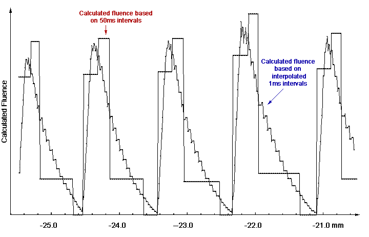
When keeping the original 50ms intervals for fluence calculation, a much more "stair-step"-like curve is obtained. The higher the interpolation, the smoother the curve.
The pixel size as the second complication simply means that one has to restrict oneself to a calculation pixel size that makes sense. I usually count 10 to 50 "raw" pixels as one (adding them together), so I end up with a real-world resolution of 0.2 to 1mm at isocenter distance (where a film is usually placed).
back to DMLC home